(joanna kalisz)

Cafe Fürst

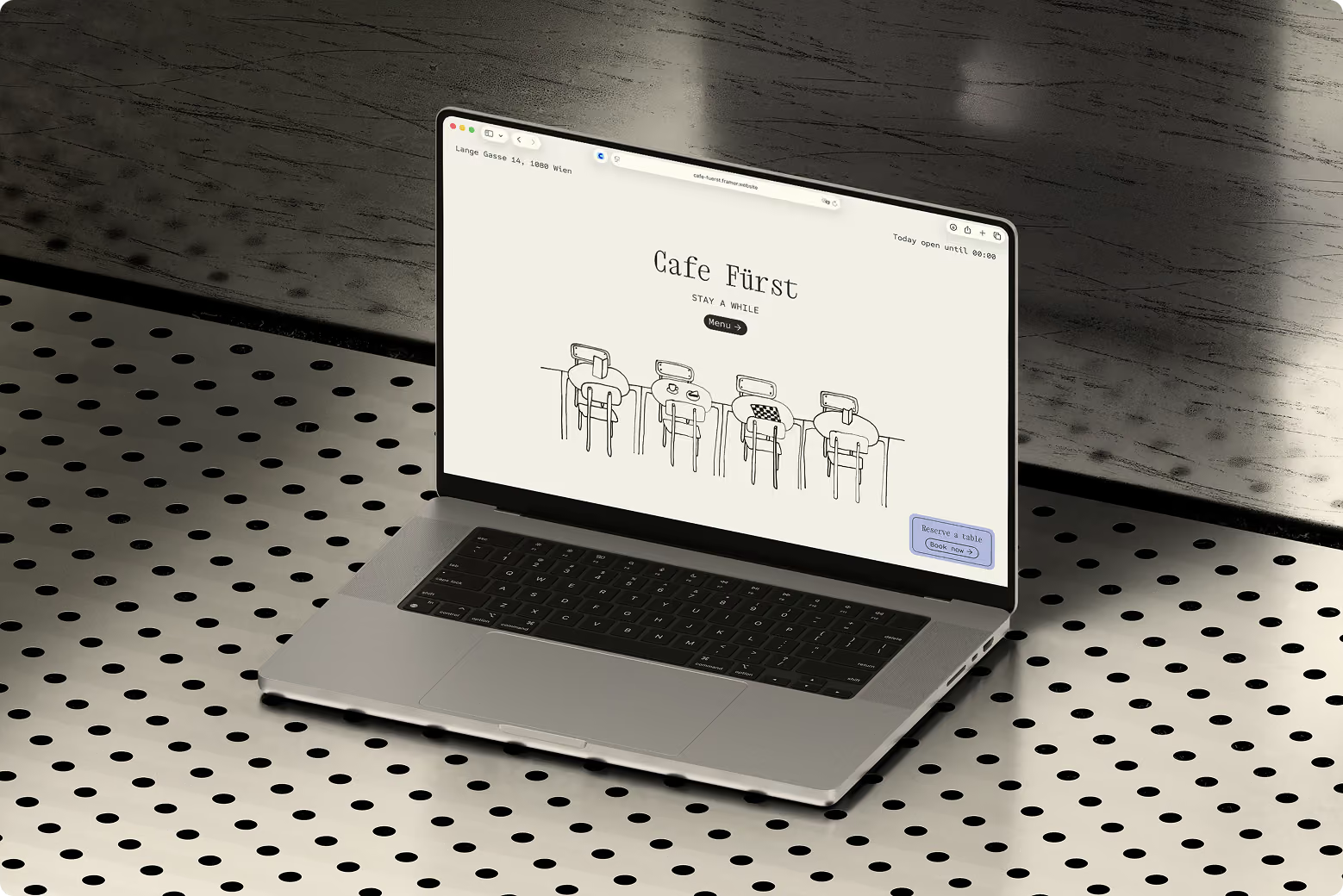
Cafe Fürst is a design concept for a fictional Viennese Kaffeehaus, designed to feel like a place anyone would want to sit in for a while. The idea centers on an unhurried, welcoming atmosphere: chess and cards on hand, two coffee blends offered side by side so different tastes are accomodated, a traditional Kaffeehaus interior carried into a digital presence that feels up-to-date. The intention was a space open to everyone: regulars and newcomers alike, not one particular crowd.


type

Illustrated website

Focus

Custom illustrations, Menu

Year

2026

Location

Vienna, Austria

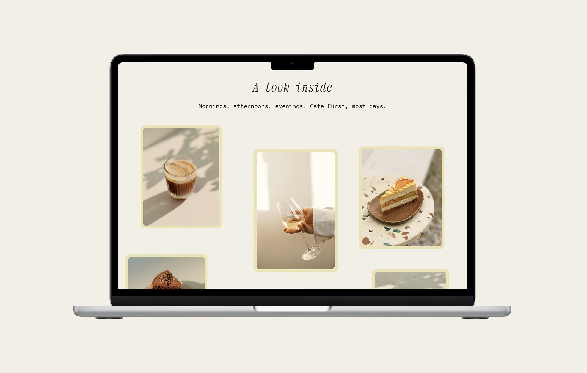
Traditional Kaffeehaus branding tends to carry over into web design as something quite dated: heavy on formality, ornate detail, and a look that can feel more like a museum than a place to casually drop in. The challenge was choosing a more modern visual approach instead, and finding other ways to carry the warmth and welcoming feeling through: colour, illustration, photography, and copy, rather than through overtly traditional visual cues. Where photography was used, sourcing carefully and editing consistently mattered: stock imagery needed to feel cohesive with the rest of the identity rather than like a placeholder dropped in to fill a gap.
No items found.
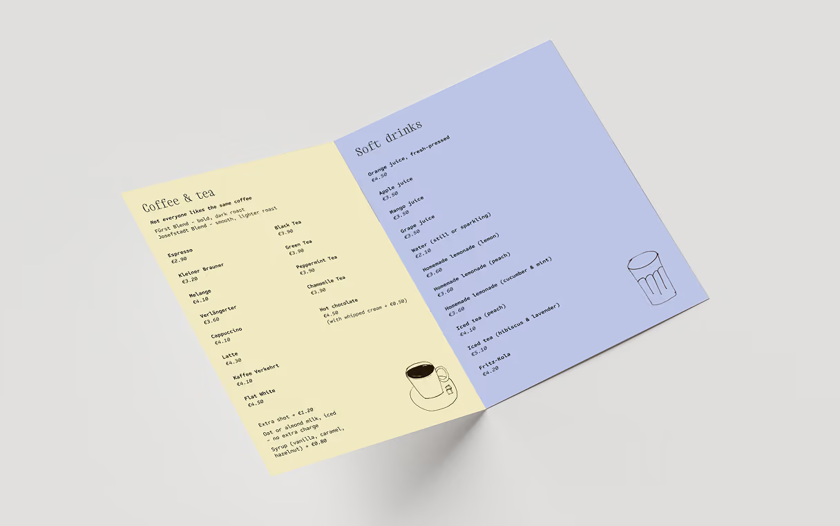
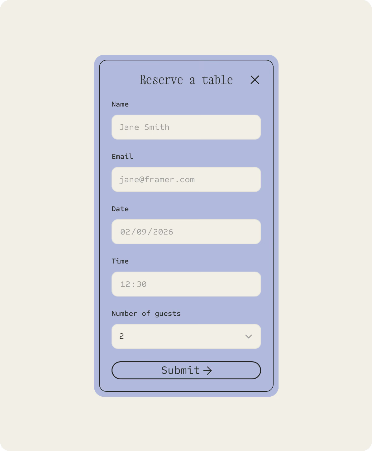
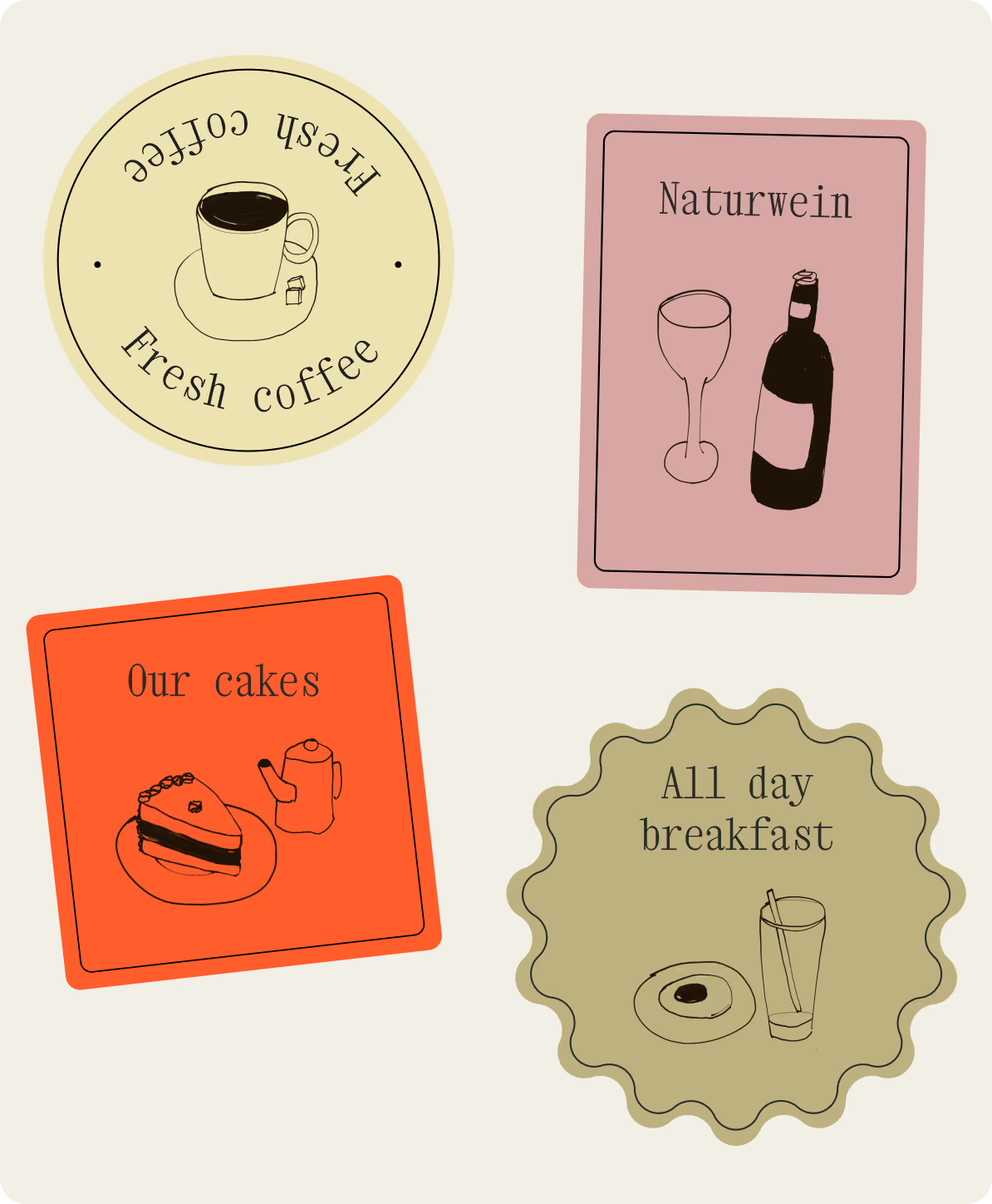
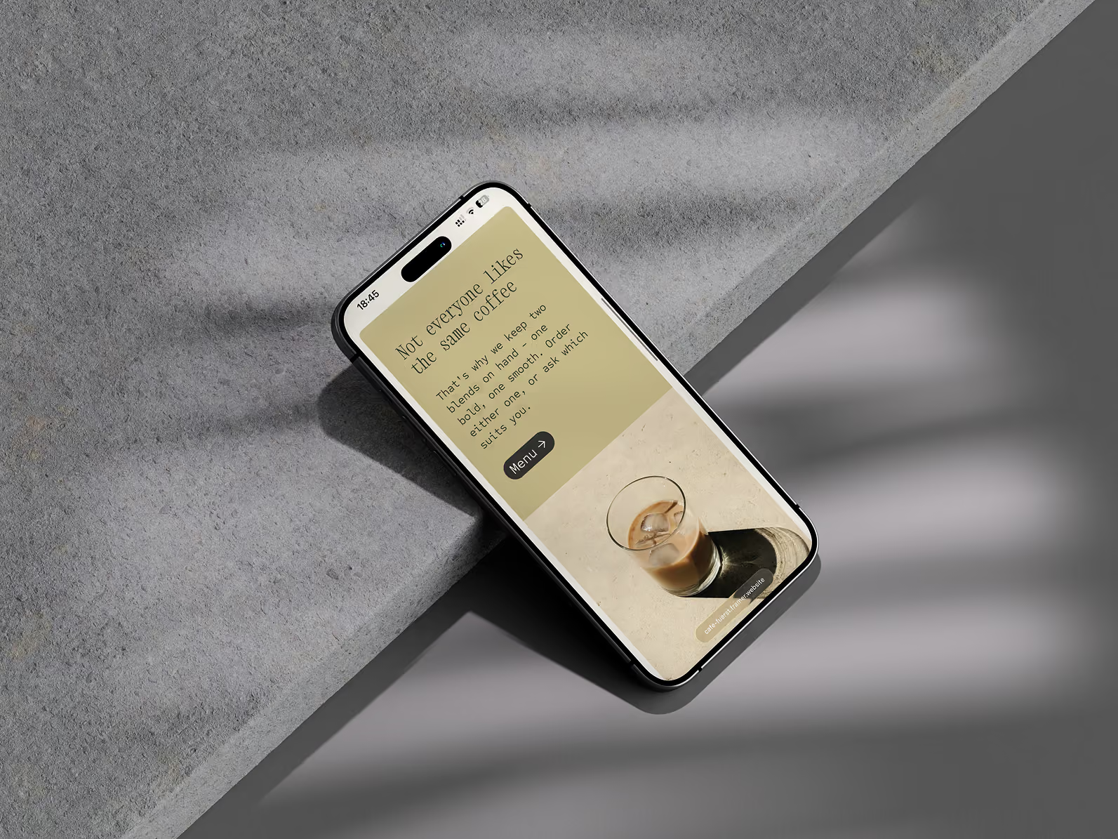
The visual identity was built around a fully hand-illustrated style: warm, a little rough and unfinished at the edges, paired with a colourful but comforting palette. Photography was curated and edited to match that same warmth - a calm, warm-toned gallery brought to life with a parallax scroll effect. Alongside the core site, a standalone PDF menu was designed to match the same visual system, and a reservation form was built natively in Framer - styled precisely to the site's illustration language, with bookings routed directly by email. The full site was built responsively from the beginning.
The result is a one-page site that feels handmade and personal, creating a modern digital presence built for a wider, more varied audience. The illustration system, curated photography, designed PDF menu, and native, on-brand reservation flow work together as one cohesive identity - proof that warmth and personality can carry through a design even when it moves away from the expected, more traditional visual language.
No items found.